FIDDLE
UI CASE STUDY
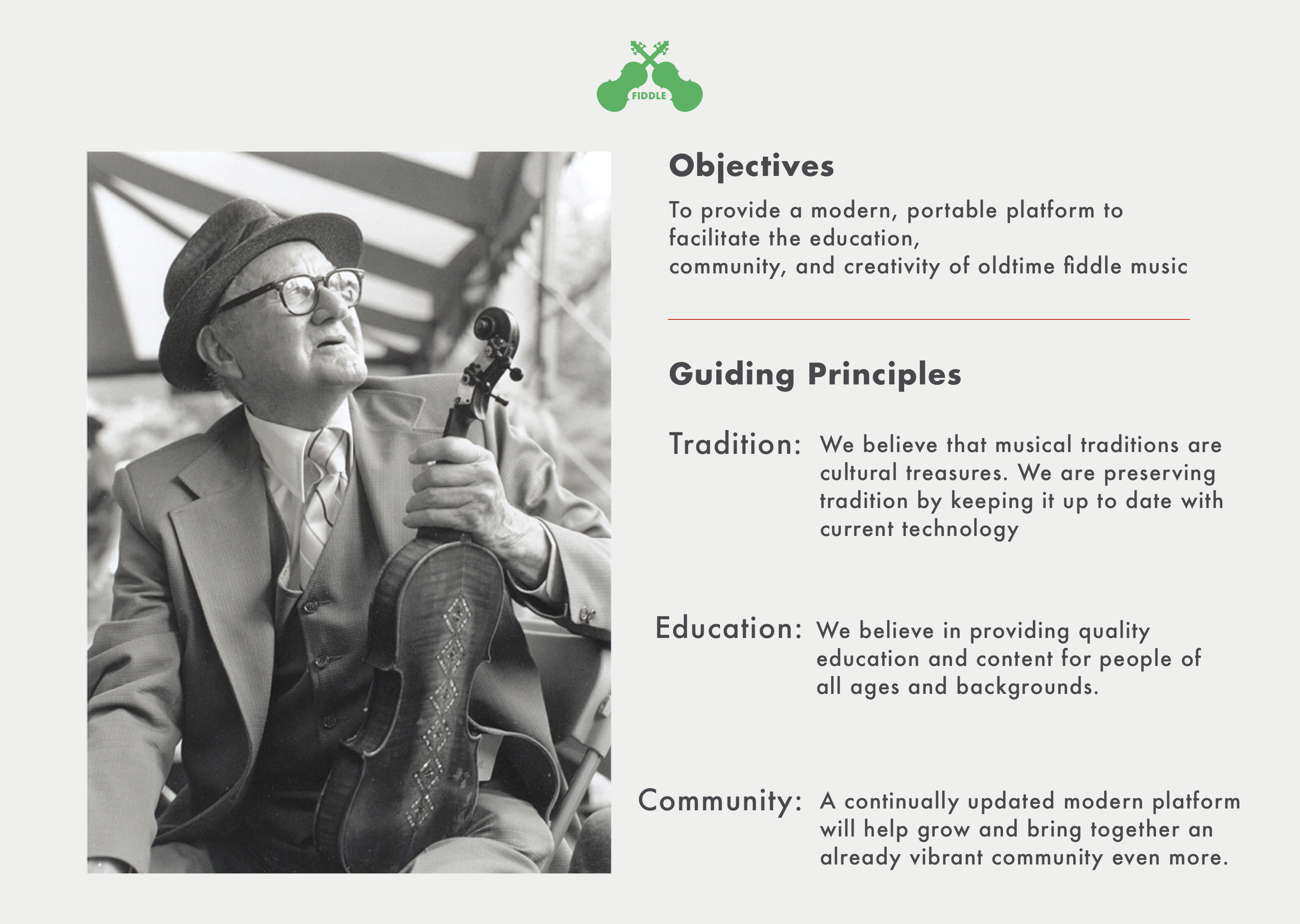
BACKGROUND
This project was made for the final design project in the UI Design Course by CareerFoundry. The requirements were to build a “complete application” consisting of the following deliverables:
- User flow diagram
- Low-fi, mid-fi, and high-fi wireframes
- User testing notes and results
- User interface design
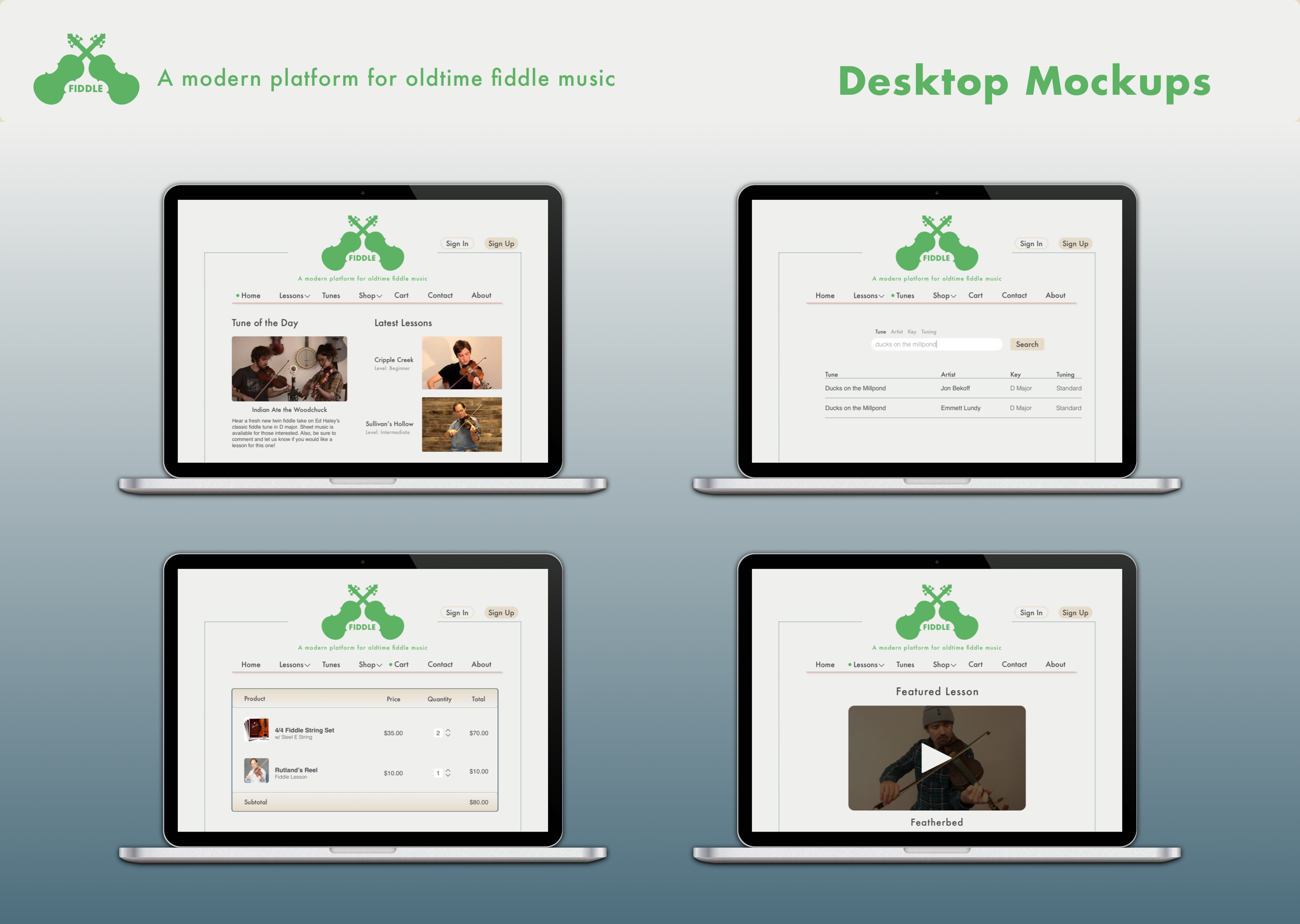
- Desktop design
- Mockups
BRANDING
As an oldtime fiddle player, I observed that there aren’t many options for learning traditional songs and techniques. It turned out that other fellow fiddle players felt the same way. Most players learn from old, grainy recordings or from fleeting musical gatherings. Fiddle developed into an idea to create a modern way (mobile app) to learn oldtime music so that you can learn anytime, anywhere.
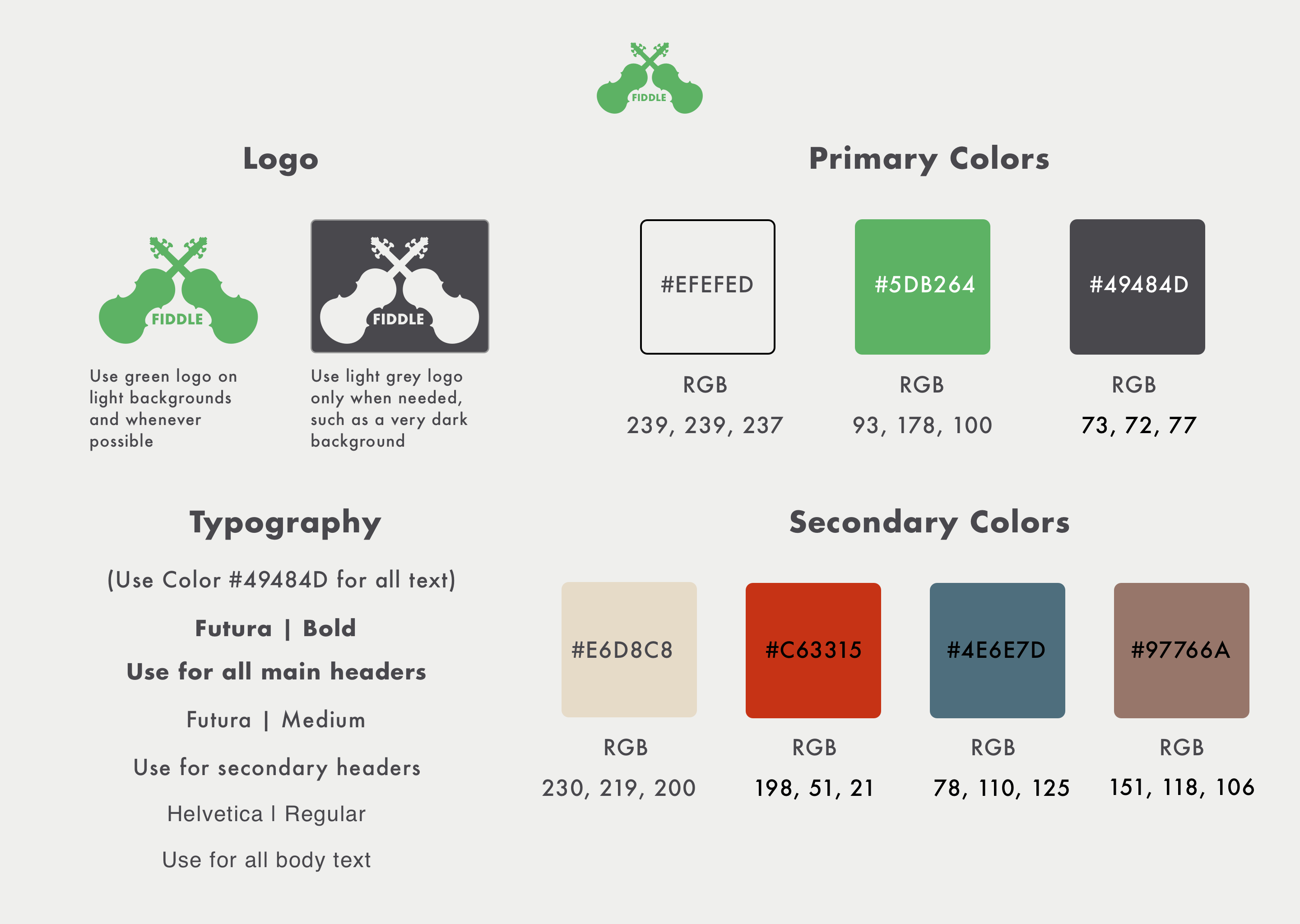
STYLE GUIDE
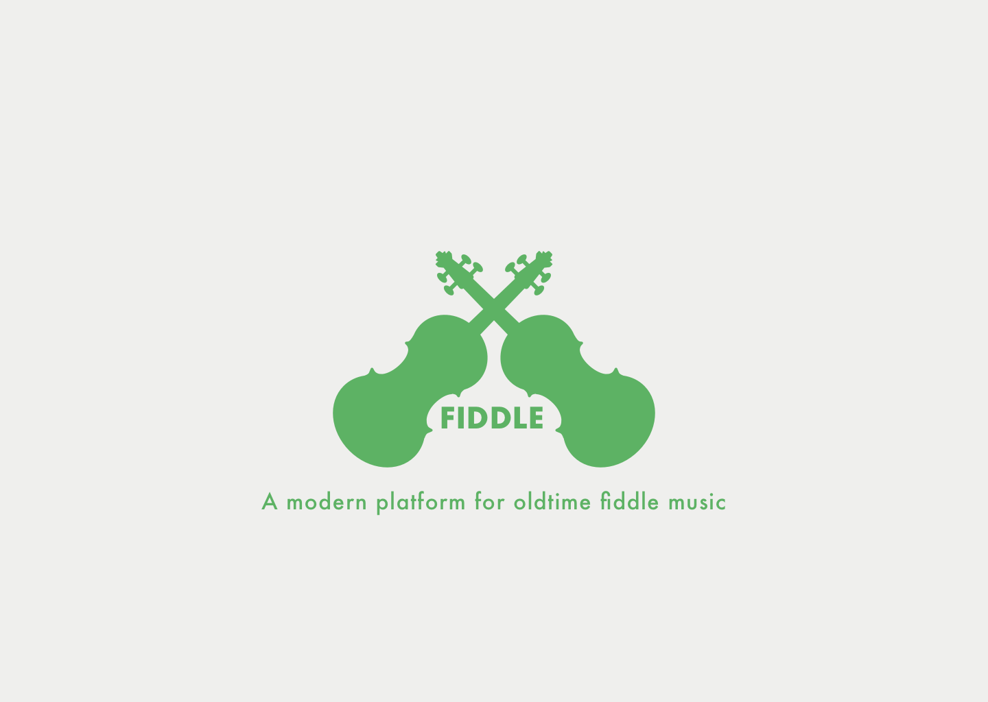
Tradition is a major part of oldtime music, so in developing the style guide, I focused my efforts on mostly muted colors. The green color for the logo was chosen to convey a message of friendliness and encouragement for students. The fiddle logo initially started as a cartoonish artsy look, but it didn’t feel right, so in order to keep in line with the modern traditional goals, I ended up tracing the outline of one of my favorite violins and simplifying the details into a vector logo using the Sketch app.
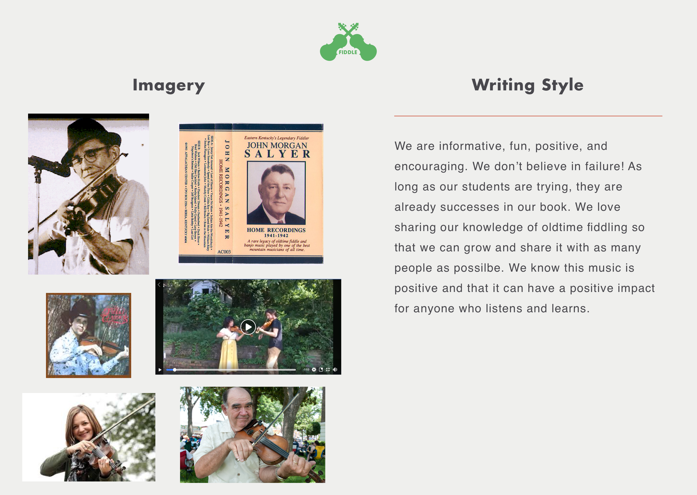
STYLE GUIDE (cont.)
I wanted the imagery to complement the colors while having character themselves, as media is a major part of any modern learning platform. The writing style was developed to be positive and engaging so that “Fiddle” would appeal to people of many ages and backgrounds.
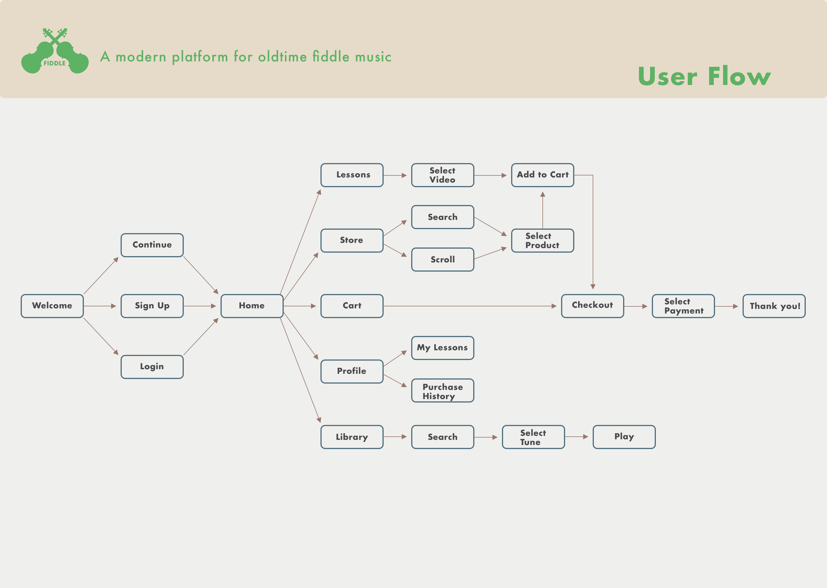
USER FLOW
The user flow was the first required deliverable. I felt like this step went smoothly because I had developed user flows for all of my other projects. This stage always helps me develop more clarity on the evolution of a user’s experience when they open my designs.
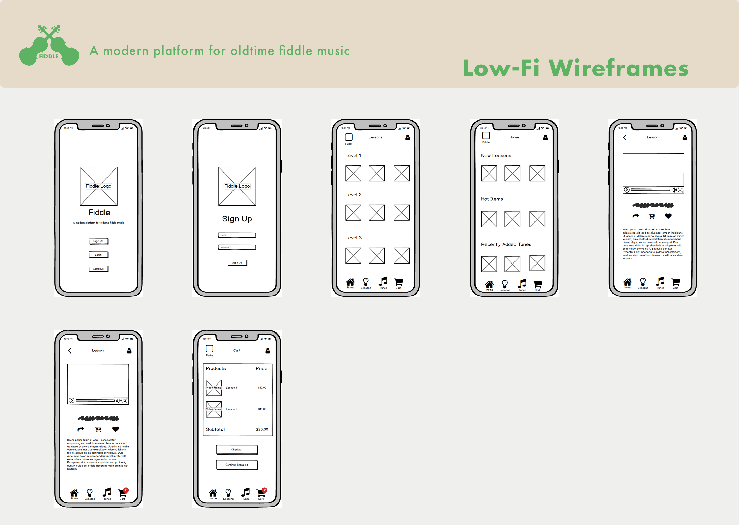
WIREFRAMING
For the low-fidelity wireframing, I elected to use Balsamiq. While I appreciated getting to know a new design tool, it would have saved me time to use my usual method, pen and paper. I like pen and paper for low-fi wireframing to brainstorm ideas quickly and not think too much. Time away from the screen in this industry is valuable.
WIREFRAMING (cont.)
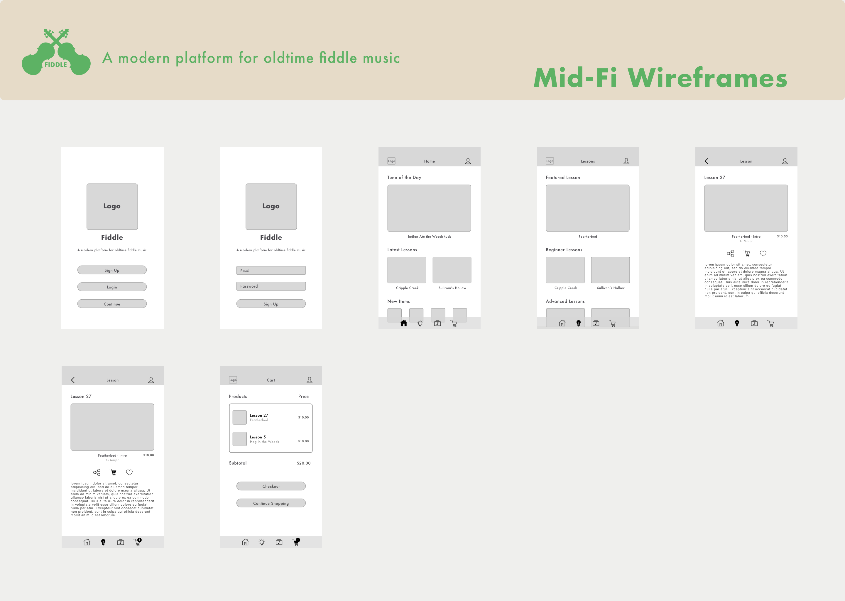
Mid-fidelity wireframes are used to finalize the layout that I want and get the “look” I’m going for without the distraction of color or media. At this stage I work a lot with grids and pay extra attention to shapes, spacing, and hierarchy.
WIREFRAMING (cont.)
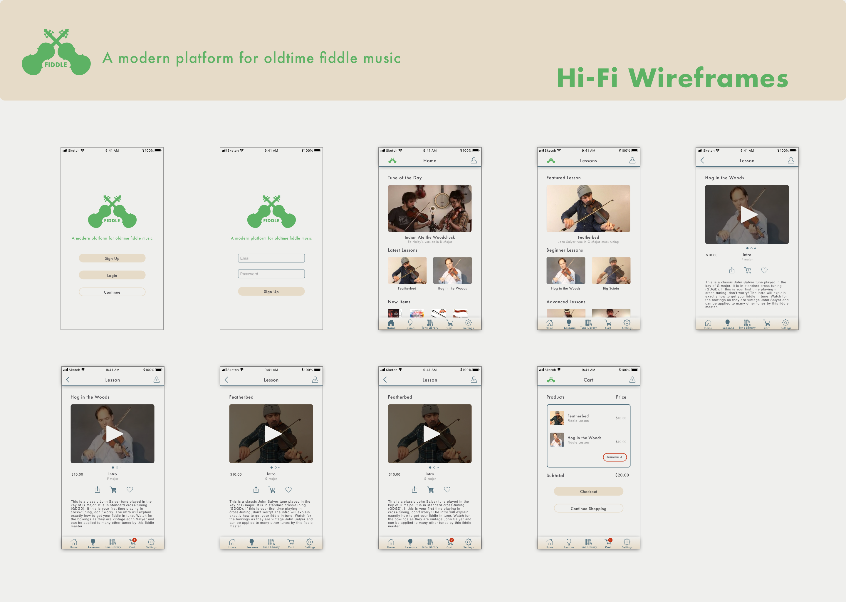
When I add all the details and colors to the wireframes, then I consider them high fidelity. In this stage, I struggled a bit with the right color combinations. Looking back, I started out with too many colors at the beginning, and that threw off my decision-making. One of my favorite mindsets is “less is more,” so next time I would follow that more closely and start with fewer colors to pick from and make adjustments accordingly.
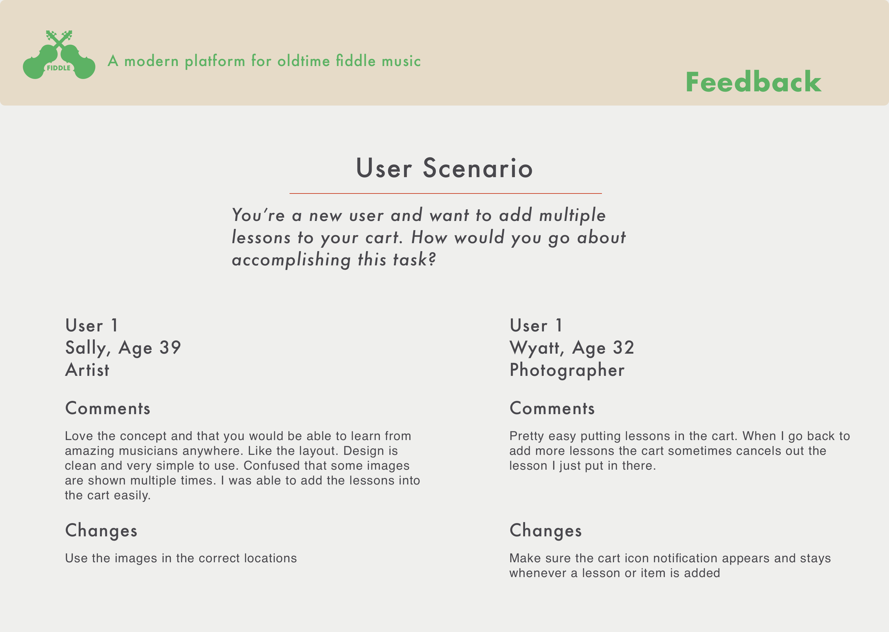
USER TESTING
Being pressed for time, I didn’t conduct as many user tests as I would have liked. However, I was very pleased with the feedback I received. No critiques were made about the design or layout. For this test, I created a prototype in InVision, a very useful prototyping tool that I use frequently. View the prototype here.
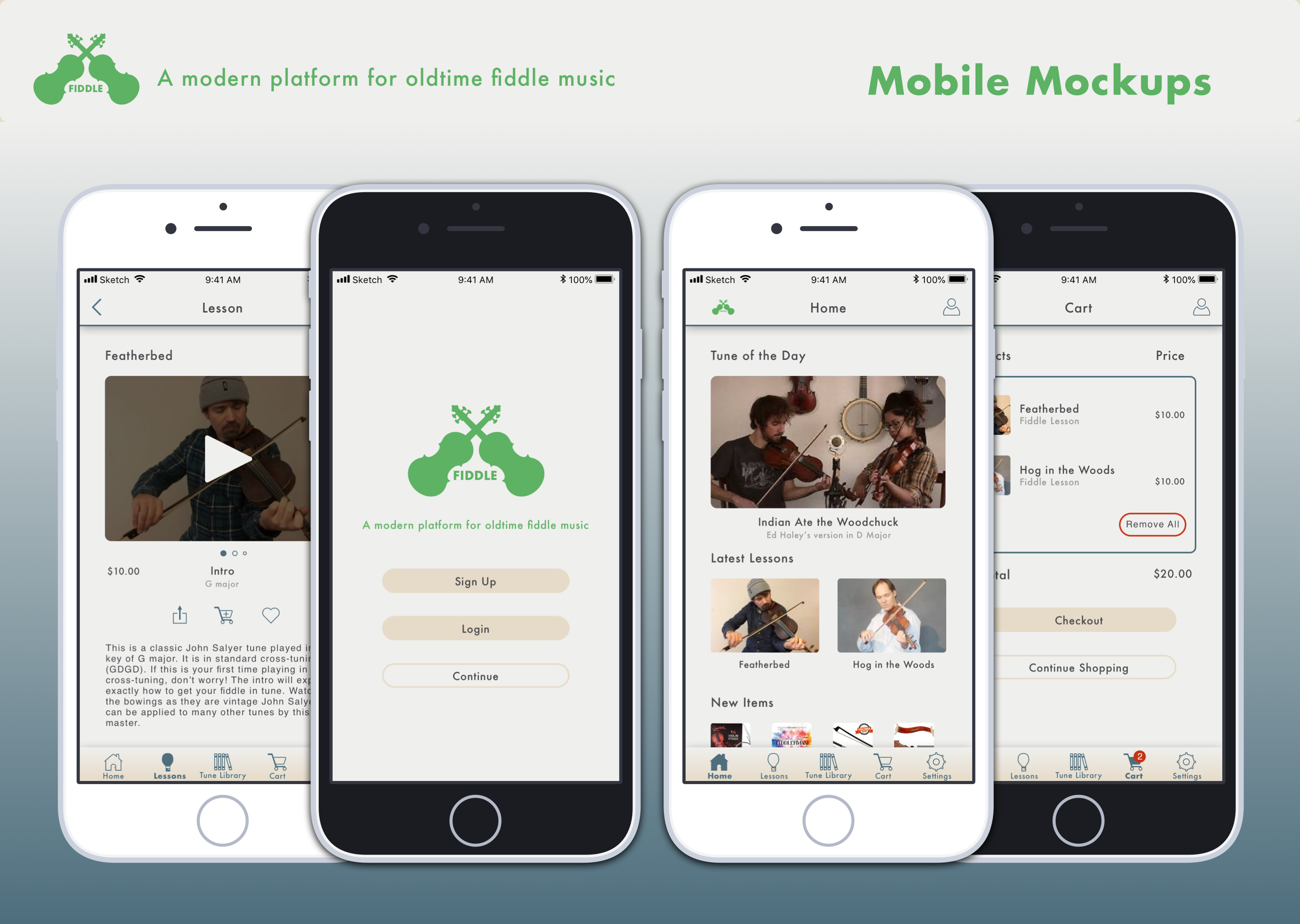
MOCKUPS
Overall I was happy with the mockups and the final results, especially considering the 4-week time constraint. I think the clean minimal layout and spacing combined with the muted color palette achieved the design goal of fusing tradition with modernism.